If you're working in Excel 2013, you should able to click on your graph and see a plus sign to the right of the graph. Click that plus sign for various options like adding axis titles, etc.
Another way to alter formatting is to go to CHART TOOLS, DESIGN, and then Quick Layout:
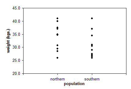
Here's an example of a properly formatted scatterplot:
Figure 1.1. Scatterplot showing mountain lion weight for the
two populations in Example 1.